
Replacing the P-O-R-S-C-H-E emblem.
 04-20-2014, 12:04 AM
#31
I agree with the coffee and cars guys. It looks pretty good to me. And I'm sort of ****.
 04-20-2014, 12:32 AM
#33
Rennlist Member
I really like the look of the black letters. The angle looks off to me though. It should curve up, no? Along that upper spoiler line?
Btw, your garage looks great. I love that floor.
Btw, your garage looks great. I love that floor.
04-20-2014, 12:33 AM
#34
Drifting
I don't think it's too low at the center, the problem is you didn't curve the tape with the curve of the spoiler lip, which is the important visual reference. The curvature of the rear bumper made the letters go downward. It's tricky. I applaud your efforts.
I would have used the lip of the spoiler as the reference point for measuring. Just measure every couple inches and run your tape on a curve. It will curve up slightly. Then do what you did as far as letter placement.
The black letters look cool!
I would have used the lip of the spoiler as the reference point for measuring. Just measure every couple inches and run your tape on a curve. It will curve up slightly. Then do what you did as far as letter placement.
The black letters look cool!
04-20-2014, 12:33 AM
#35
 04-20-2014, 12:36 AM
#36
I don't think it's too low at the center, the problem is you didn't curve the tape with the curve of the spoiler lip, which is the important visual reference. The curvature of the rear bumper made the letters go downward. It's tricky. I applaud your efforts.
I would have used the lip of the spoiler as the reference point for measuring. Just measure every couple inches and run your tape on a curve. It will curve up slightly. Then do what you did as far as letter placement.
The black letters look cool!
I would have used the lip of the spoiler as the reference point for measuring. Just measure every couple inches and run your tape on a curve. It will curve up slightly. Then do what you did as far as letter placement.
The black letters look cool!
04-20-2014, 01:10 AM
#37
Advanced

Join Date: Mar 2014
Posts: 85
Likes: 0
Received 0 Likes
on
0 Posts
04-20-2014, 03:12 AM
#38
Well...I gave it a whirl. Let's just say I wasted $75 and a few hours of my time. It doesn't look terrible, but I'm not happy with the result. I didn't listen to the advice of finding a shop with a template.
I decided to test out a badge again after seeing kmatt's post with his satin black Sport Technos.
https://rennlist.com/forums/991/7228...rt-techno.html
I wanted it to look like this but in black lettering.

I ordered up the badge from Suncoast.

I got my tools ready.

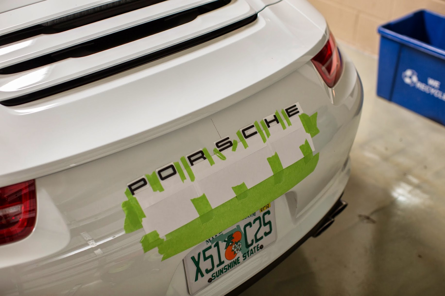
After much consternation, I settled on using some envelopes as a straight edge. I also found what I thought to be the center-line. I used a wax pencil to make a mark. I lined up the center line of the envelopes with the center of the car. Then I measured from the left and right corners of the envelopes and to the top of the bumper to make sure they were equidistant.


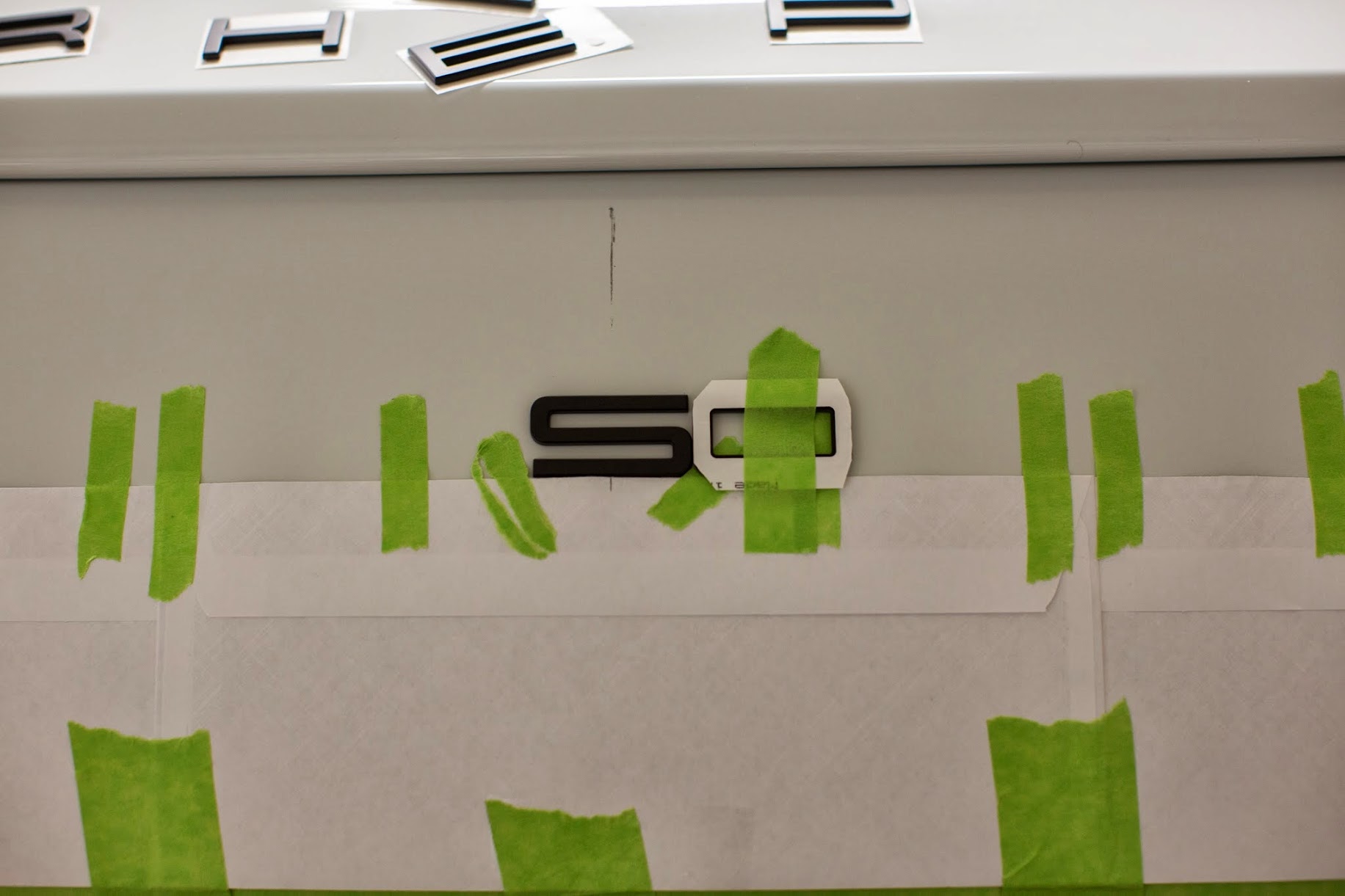
I test fit all of the letters. The vertical lines are taped just to keep the letters from falling under the envelopes.

I prepped the surface with some IPA.


I used someone's suggestion that the "O" could be used to set the spacing.

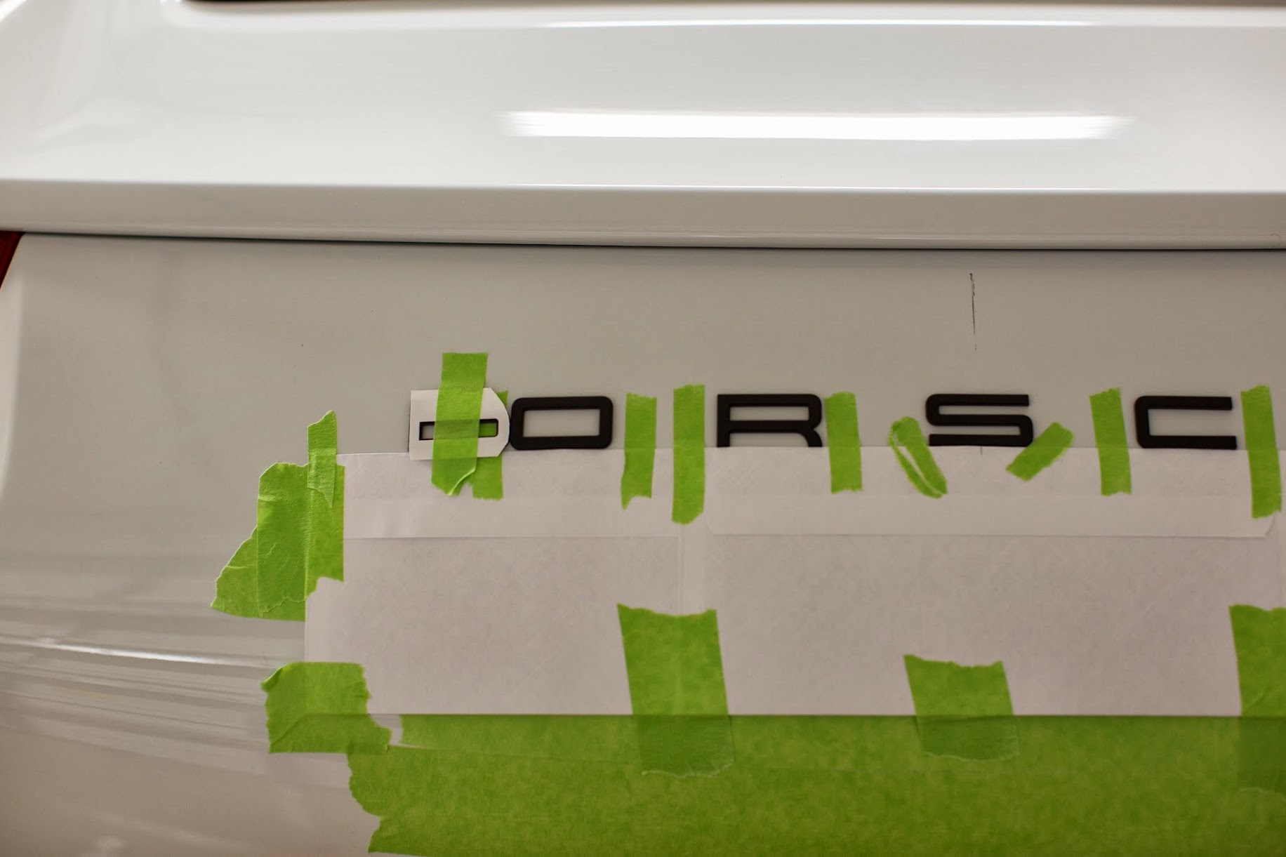
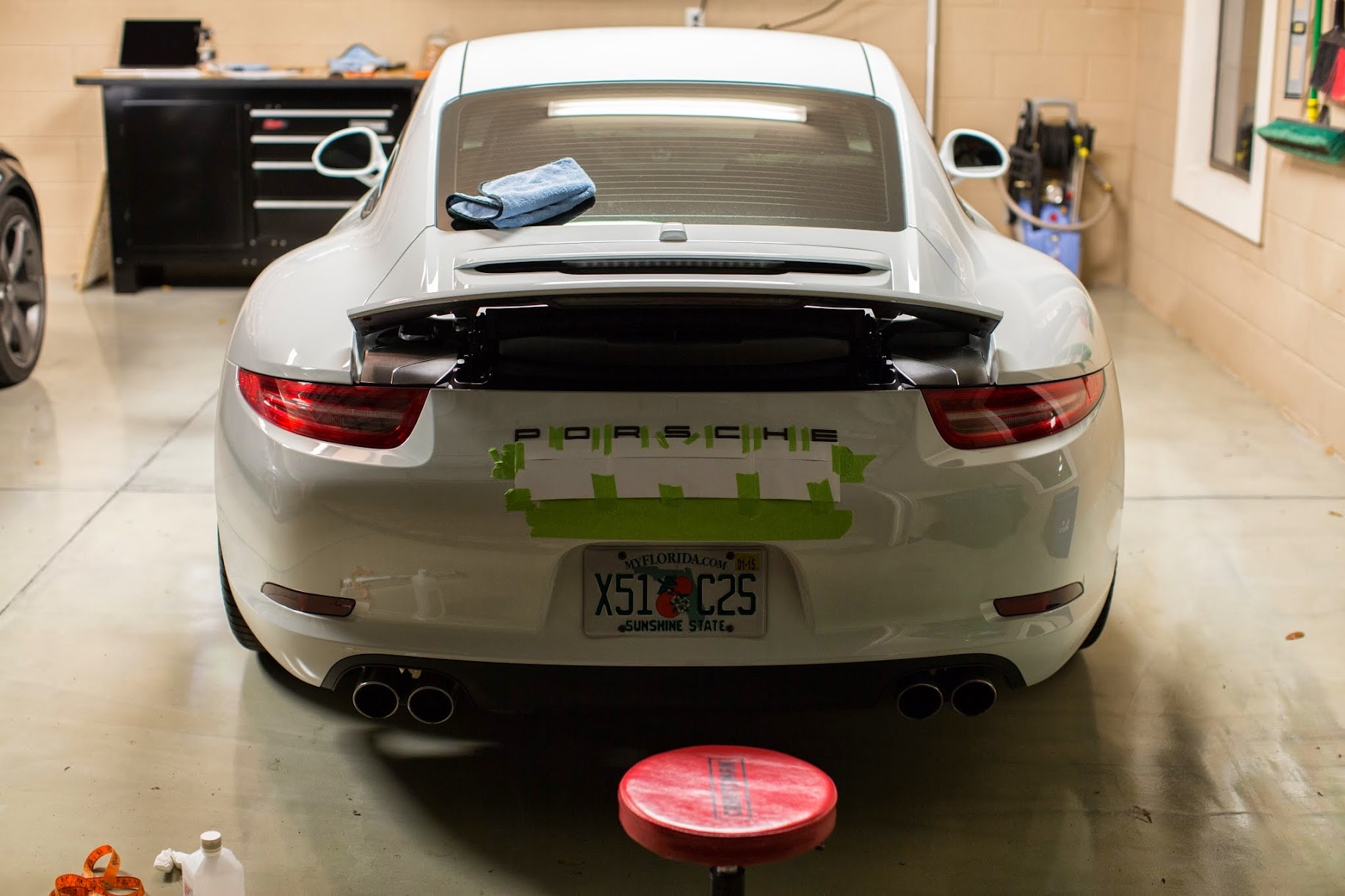


And the result is a curved looking badge. Obviously I did it wrong, and laying the envelopes on the curved bumper makes a curved line. Despite being schooled in engineering, the concept eludes me.


As you can see in the photos, it appears that the "S" is off to the right when referring to the Sat. Radio antenna. I'm not sure what's up with that. The "P" and "E" are equidistant from the lights.


Conclusions:
It it super hard to measure and align on a curved surface with no square reference points. I'm going to leave it on for a while to make sure I want a badge back there.
After all this, I still don't know how to do it correctly. I think the better way to do it would have been to lay out the letters properly spaced and aligned to a straight line on a flat table. Then run a piece of tape across the completed emblem. I thought it would be easy to run a few pieces of tape across the bumper to find the proper spot to layout the letters. I was wrong. Also, I installed to too low on the bumper.
The guys at Cars and Coffee today didn't think it looked bad. I'll take some more shots in the sun in the next few days.
If I decide to keep a badge, I'm going to find a shop with a template. I washed the car today after a day with it on. I hated using a towel to get in the cracks. I ended up having to go to my bathroom cabinet to break out the q-tips to clean it so I would be able to sleep tonight. This is why I hate badges. I think the simplest fix is to get the Tech Art wing.
I decided to test out a badge again after seeing kmatt's post with his satin black Sport Technos.
https://rennlist.com/forums/991/7228...rt-techno.html
I wanted it to look like this but in black lettering.
I ordered up the badge from Suncoast.
I got my tools ready.
After much consternation, I settled on using some envelopes as a straight edge. I also found what I thought to be the center-line. I used a wax pencil to make a mark. I lined up the center line of the envelopes with the center of the car. Then I measured from the left and right corners of the envelopes and to the top of the bumper to make sure they were equidistant.
I test fit all of the letters. The vertical lines are taped just to keep the letters from falling under the envelopes.
I prepped the surface with some IPA.
I used someone's suggestion that the "O" could be used to set the spacing.
And the result is a curved looking badge. Obviously I did it wrong, and laying the envelopes on the curved bumper makes a curved line. Despite being schooled in engineering, the concept eludes me.
As you can see in the photos, it appears that the "S" is off to the right when referring to the Sat. Radio antenna. I'm not sure what's up with that. The "P" and "E" are equidistant from the lights.
Conclusions:
It it super hard to measure and align on a curved surface with no square reference points. I'm going to leave it on for a while to make sure I want a badge back there.
After all this, I still don't know how to do it correctly. I think the better way to do it would have been to lay out the letters properly spaced and aligned to a straight line on a flat table. Then run a piece of tape across the completed emblem. I thought it would be easy to run a few pieces of tape across the bumper to find the proper spot to layout the letters. I was wrong. Also, I installed to too low on the bumper.
The guys at Cars and Coffee today didn't think it looked bad. I'll take some more shots in the sun in the next few days.
If I decide to keep a badge, I'm going to find a shop with a template. I washed the car today after a day with it on. I hated using a towel to get in the cracks. I ended up having to go to my bathroom cabinet to break out the q-tips to clean it so I would be able to sleep tonight. This is why I hate badges. I think the simplest fix is to get the Tech Art wing.
 04-20-2014, 08:56 AM
#39
Racer
Join Date: Jan 2014
Location: You Don't Mess with the Zohan
Posts: 487
Likes: 0
Received 3 Likes
on
3 Posts
Your atantion to detail in almost implacable and it looks good but you missed a something big. knowing how you are I hate to tell you this.
The letters on a factory job are parallel to the top of the rear bumper/ spoiler. The bumper is curvier out and because you used a straight paper to aligh the badge it is curving down. This is ruining the lines in a back
The letters on a factory job are parallel to the top of the rear bumper/ spoiler. The bumper is curvier out and because you used a straight paper to aligh the badge it is curving down. This is ruining the lines in a back
The following users liked this post:
myw (11-24-2020)
04-20-2014, 11:01 AM
#41
04-21-2014, 05:50 PM
#43
Burning Brakes
$65-70 bucks for parts from dealer. Free installation by dealer using a stencil. No muss, no fuss, perfect letter placement. Ask me how I know. 
04-21-2014, 07:21 PM
#45
Rennlist Member